This is a short tutorial for creating boxplots with ggplot2. The tutorial will focus on:
- data preparation for plotting with ggplot2
- differences between the standard R plotting system and ggplot2
- using geom_boxplot to create a simple boxplot with ggplot2 and aesthetics
- customizing format and graphic appearance of the plot
- running an ANOVA analysis and annotating the results on the plot
Let’s start by loading ggplot2 (assuming the package has already been installed) and by defining two custom functions that will be used later on.
library(ggplot2)
#
# Custom functions
#
make_contrast_coord <- function(n) {
tmp <- do.call(rbind,lapply(1:n, (function(i){
do.call(rbind,lapply(1:n, (function(j){
if(j > i) {
c(i,j)
}
})))
})))
tmp <- data.frame(tmp)
colnames(tmp) <- c(“str”, “end”)
tmp$ave <- apply(tmp, 1, mean)
tmp$len <- apply(tmp, 1, (function(vct){ max(vct) – min(vct) }))
return(tmp)
}
pval_to_asterisks <- function(p_vals) {
astk <- sapply(as.numeric(as.character(p_vals)), (function(pv){
if(pv >= 0 & pv < 0.0001) {
“****”
} else if (pv >= 0 & pv < 0.001) {
“***”
} else if (pv >= 0 & pv < 0.01) {
“**”
} else if (pv >= 0 & pv < 0.05) {
“*”
} else {
NA
}
}))
return(astk)
}
Now, let’s generate some data. Often, data may is available in a matrix-like format (especially if the dataset was generated using Excel or a similar software), where each column corresponds to a different condition and each row is a different measure. Here’s an example:
set.seed(999)
my_data <- matrix(sapply(c(1,2.2,2.9,4.2), (function(i){ rnorm(20, 30 + (5*i), 7+i)})),
nrow = 20,
ncol = 4,
dimnames = list(paste(“r”, as.character(1:20), sep =””), c(“A”, “B”, “C”, “D”)))
head(my_data)# A B C D
# r1 32.74608 29.69722 39.69220 40.65891
# r2 24.49952 46.91601 44.58413 64.04748
# r3 41.36147 37.69018 31.80708 62.67117
# r4 37.16056 43.70513 33.49537 63.36288
# r5 32.78155 30.64753 47.47659 50.79196
# r6 30.47181 46.90884 47.23714 38.15407
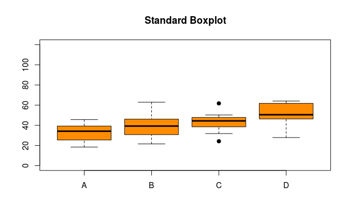
A numeric matrix can be easily handled by the default R plotting system. To generate a boxplot, it is sufficient to call the ‘boxplot’ function and provide the ‘my_data’ matrix as its only argument. Here following, there is the resulting plot.
boxplot(my_data, col = “darkorange”, pch = 19, ylim = c(0,120), main = “Standard Boxplot”)
 Unlike the standard R plotting system, ggplot cannot generate a boxplot starting from data formatted this way. First, we have to convert the matrix in a data frame where each column corresponds to a different variable. Here, we only have 2 variables: the condition that defines the grouping (group) and the measured values (value). We can easily convert a matrix into a data.frame suitable for creating a ggplot2 graph.
my_df <- data.frame(do.call(rbind, lapply(colnames(my_data), (function(clnm){
values <- my_data[,clnm]
group <- rep(clnm, nrow(my_data))
cbind(values, group) # Note that this returns a character matrix
}))), row.names = NULL)
my_df$values <- as.numeric(as.character(my_df$values))#
head(my_df)
# values group
# 1 32.74608 A
# 2 24.49952 A
# 3 41.36147 A
# 4 37.16056 A
# 5 32.78155 A
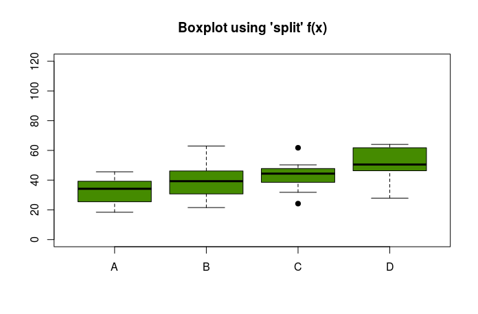
We can still plot a boxplot using this data.frame as input. It is sufficient to split the values according to the factor ‘group’. The result is identical to the boxplot we generated before.
boxplot(split(my_df$values, my_df$group),
col = “chartreuse4”, pch = 19, ylim = c(0,120), main = “Boxplot using ‘split’ f(x)”)
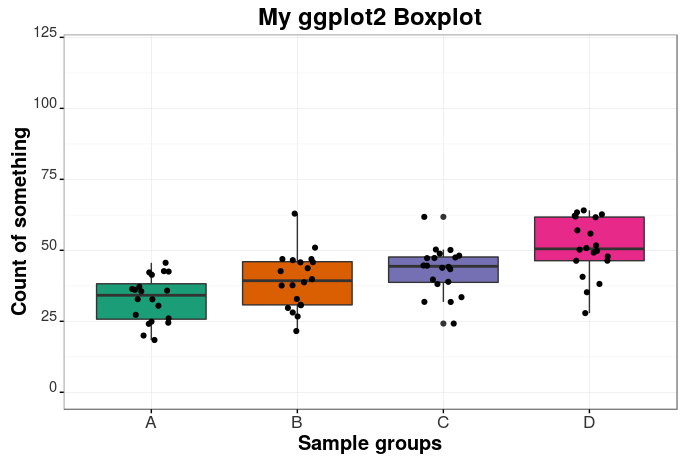
 Now it’s time to start plotting a nice-looking boxplot with ggplot2. We can very easily plot a simple boxplot with just a couple of lines of code.
bp <- ggplot(my_df, aes(x = group, y = as.numeric(values), fill = factor(group)))
bp <- bp + geom_boxplot(notch = F)
bp
The beauty of ggplot2 is the possibility of customizing almost every single detail of the plot in a very simple and immediate way. Moreover, ggplot2 documentation is pretty extensive and several examples, tutorials and workarounds may be found online (just Google your question). For example, we can easily improve our boxplot by changing plot title, labels, axes, font types, colors, margins and plotting jittered points as follows.
bp <- bp + labs(title=”My ggplot2 Boxplot”, x=”Sample groups”, y = “Count of something”)
bp <- bp + theme_bw()
bp <- bp + theme(legend.position=”none”) # Remove legend
bp <- bp + theme(axis.text.x = element_text(colour=”grey20″,size=13,angle=0,hjust=.5,vjust=.5,face=”plain”),
axis.text.y = element_text(colour=”grey20″,size=11,angle=0,hjust=1,vjust=0,face=”plain”),
axis.title.x = element_text(colour=”black”,size=15,angle=0,hjust=.5,vjust=0,face=”bold”),
axis.title.y = element_text(colour=”black”,size=15,angle=90,hjust=.5,vjust=.5,face=”bold”),
plot.title = element_text(size=18, face = “bold”))
bp
Here’s the result.
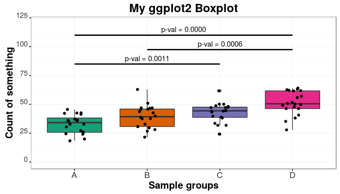
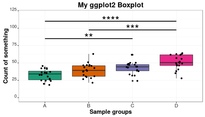
 The last part of this tutorial is about how to annotate the boxplot. Very often, we may want to highlight statistically significant differences among groups. For this, we may want to run an ANOVA analysis and annotate the results on the plot. The aov and the TukeyHSD functions from the stats package can be used for performing the ANOVA analysis. We will then make use of our custom made functions to compute the positions (along the x axis) for the annotations and for converting p values to asterisks.
my_anova <- aov(values~group, data = my_df)
my_anova <- TukeyHSD(my_anova)
my_anova <- data.frame(cbind(my_anova$group,
make_contrast_coord(length(levels(my_df$group)))))
my_anova$astks <- pval_to_asterisks(my_anova$p.adj)
We will discard all non-significant differences (p-val > 0.05). The corresponding rows will be removed from the anova matrix.
tiny_anova <- my_anova[my_anova$p.adj < 0.05,]
tiny_anova <- tiny_anova[order(tiny_anova$len, decreasing = FALSE),]
We wrap up by annotating the values on the plot. For this, we use the annotate function and we specify the type of annotation (“text” or “segment”) as well as other graphical parameters.
lowest.y <- 85
highest.y <- 110
margin.y <- 5
actual.ys <- seq(lowest.y, highest.y, length.out = nrow(tiny_anova))
tiny_anova$ys <- actual.ys
bp_ask <- bp + annotate(“segment”, x = tiny_anova$str, y = tiny_anova$ys,
xend = tiny_anova$end, yend = tiny_anova$ys,
colour = “black”, size = 0.95)
bp_val1 <- bp_ask + annotate(“text”, x = tiny_anova$ave, y = (tiny_anova$ys + margin.y) ,
xend = tiny_anova$end, yend = tiny_anova$ys,
label = paste (“p-val =”, format(round(tiny_anova$p.adj, 4), nsmall = 4)))
bp_ask <- bp_ask + annotate(“text”, x = tiny_anova$ave, y = (tiny_anova$ys + (margin.y/3)) ,
xend = tiny_anova$end, yend = tiny_anova$ys,
label = tiny_anova$astks, size = 10)
Success! We generated two very cool-looking (publication-grade) boxplots! Here they are. Nice-looking, aren’t they?
You can find the full version of the code for generating these boxplots with ggplot2 on my GitHub. Please, visit:
https://github.com/dami82/ggplot2/blob/master/boxplot.R
Thank you!!
Hi your code was very useful.
Many thanks
Mahdi