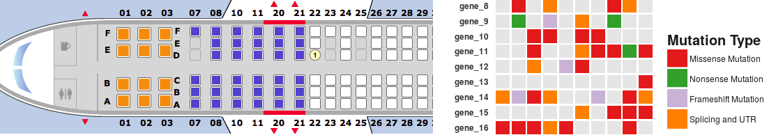
This is a short tutorial for creating “geom tile” charts with ggplot2. These type of plots are similar to heat maps, but they picture a variable featuring a discrete number of possible levels (categories) instead of continuous numeric values. I usually refer to these type of charts as “seat map” as they remind me of flight seat maps. For showing seats available for booking, flight company websites often display a chart where each box is a seat and each color corresponds to a specific type of seat (available, unavailable, booked, extra-comfort seat and so on). Some types of data are very effectively illustrated by a chart of this type. A good example is a summary of DNA mutation types affecting a list of genes in a set of samples. A seatmap chart will work great.
 This tutorial will focus on:
- data preparation for creating a seatmap chart from DNA mutation data using ggplot2
- differences between the standard R plotting system and ggplot2
- using geom_tile() to create a simple seatmap chart with ggplot2 and aesthetics
- customizing format and graphic appearance of the chart
Let’s start by loading ggplot2 (assuming the package has already been installed) and by generating some data to work with.
library(ggplot2)
# Generate some data (matrix-format)
set.seed(999)
my_opts <- c(NA, “Missense Mutation”, “Frameshift Mutation”, “Nonsense Mutation”, “Splicing and UTR”)
my_genes <- paste(“gene”, 1:25, sep = “_”)
my_samples <- paste(“SMPL”, 1:10, sep = “”)
my_mat <- matrix(data = sample(x = my_opts,
size = (length(my_genes) * length(my_samples)),
replace = TRUE,
prob = c(0.8, 0.3, 0.1, 0.1, 0.2)),
nrow = length(my_genes),
ncol = length(my_samples),
dimnames = list(my_genes, my_samples))
my_mat[1:10,1:3]
# SMPL1 SMPL2 SMPL3
# gene_1 NA NA NA
# gene_2 “Splicing and UTR” NA NA
# gene_3 “Missense Mutation” “Splicing and UTR” NA
# gene_4 NA “Missense Mutation” “Missense Mutation”
# gene_5 “Frameshift Mutation” NA “Missense Mutation”
# gene_6 NA NA NA
# gene_7 NA NA NA
# gene_8 NA “Missense Mutation” NA
# gene_9 NA “Nonsense Mutation” NA
# gene_10 NA NA “Missense Mutation”
A matrix-like data structure is the most intuitive structure for saving these data. Our data are “characters”, therefore they cannot be rendered graphically by the standard R plotting system. If we try to call the plot() function on my_mat, an error is returned. In order to generate a simple chart using these data, data should first be converted to a numeric matrix. For example, we can assign an arbitrary integer to each level of our categorical variable. To perform such task, it is possible to use the following code.
my_levels <- unique(as.vector(my_mat))
num_mat <- apply(my_mat,2,(function(clmn){
sapply(clmn, (function(jj){
if (is.na(jj)) 1
else if (jj == my_levels[2]) 2
else if (jj == my_levels[3]) 3
else if (jj == my_levels[4]) 4
else if (jj == my_levels[5]) 5
}))
}))
head(num_mat)
# SMPL1 SMPL2 SMPL3 SMPL4 SMPL5 SMPL6 SMPL7 SMPL8 SMPL9 SMPL10
# gene_1 1 1 1 1 1 1 1 2 2 1
# gene_2 2 1 1 2 1 1 1 1 5 1
# gene_3 3 2 1 1 1 4 3 5 3 3
# gene_4 1 3 3 3 1 1 5 1 1 3
# gene_5 4 1 3 1 4 3 2 1 1 1
# gene_6 1 1 1 1 2 1 1 3 1 2
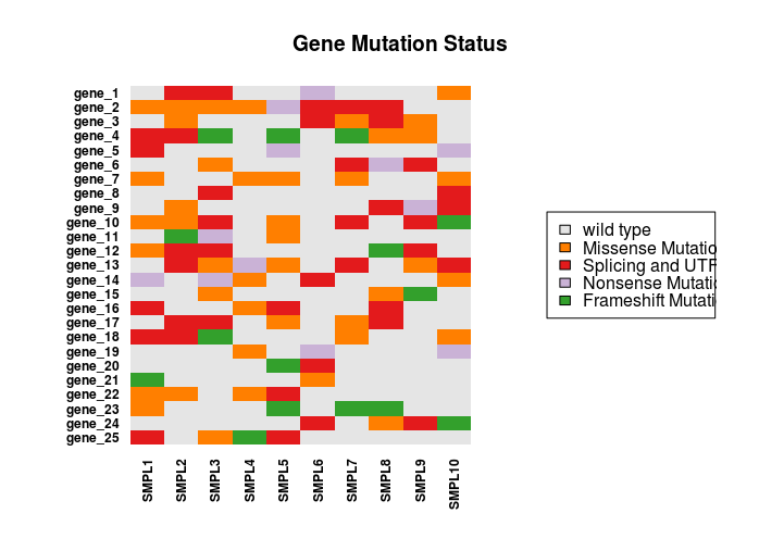
The numeric matrix can be imaged to produce the following chart
my_colors <- c(“gray90”, “#ff7f00”, “#e31a1c”, “#cab2d6”, “#33a02c”)
image(t(num_mat)[,nrow(num_mat):1], frame = FALSE, axes = FALSE, # reverse the column order in order to display genes in ascending order from top to bottom
xlim = c(-0.2,1.85),
ylab = “”, xlab = “”,
col = my_colors,
main = “Gene Mutation Status”)
legend(“right”,
legend = c(“wild type”, my_levels[2:5]),
fill = my_colors)
axis(1, at = seq(0, 1, along.with = my_samples), labels = my_samples, cex.axis = 0.75, font = 2, las = 2, tick = FALSE, pos = 0.0)
axis(2, at = seq(0, 1, along.with = my_genes), labels = my_genes[length(my_genes) : 1], cex.axis = 0.75, font = 2, las = 1, tick = FALSE, pos = -0.02)
Here is the resulting chart.
 It is possible to generate a better looking chart using ggplot2. First, data needs to be formatted to a data.frame with a column for each variable (genes, samples, status). To prepare data, it is possible to loop through all columns and rows with the following code.
my_df <- data.frame(do.call(rbind, lapply(1:nrow(my_mat), (function(i){
t(sapply(1:ncol(my_mat), (function(j){
c(rownames(my_mat)[i],
colnames(my_mat)[j],
my_mat[i,j])
})))
}))))
colnames(my_df) <- c(“gene”,”sample”,”status”)
head(my_df)
# gene sample status
# 1 gene_1 SMPL1 <NA>
# 2 gene_1 SMPL2 <NA>
# 3 gene_1 SMPL3 <NA>
# 4 gene_1 SMPL4 <NA>
# 5 gene_1 SMPL5 <NA>
# 6 gene_1 SMPL6 <NA>
Once the data are prepared, the chart can be generated using ggplot and geom_tile. The scale_x_discrete and scale_y_discrete functions may be used to set the order of genes in the rows and samples in the columns. Also, scale_fill_manual will be used to set the colors used for displaying the different categories (levels) in the chart.
p <- ggplot(my_df, aes(y=gene, x=sample))
p <- p + geom_tile(aes(fill=status), width=.875, height=.875)
p <- p + scale_y_discrete(limits=rev(unique(my_df$gene)))
p <- p + scale_x_discrete(limits=unique(my_df$sample))
p <- p + theme_minimal(base_size = 11) + labs(x = “”, y = “”)
p <- p + labs(title = “Gene Mutation Status”)
p <- p + scale_fill_manual(values = my_colors[c(4,3,5,2)], name = “Mutation Type”,
breaks = levels(my_df$status)[c(2,3,1,4)],
na.value = “grey90”)
p <- p + guides(color = guide_legend(ncol = 1)) +
theme(legend.key = element_rect(size = 2, color = “white”),
legend.key.size = unit(1.5, ‘lines’))
p
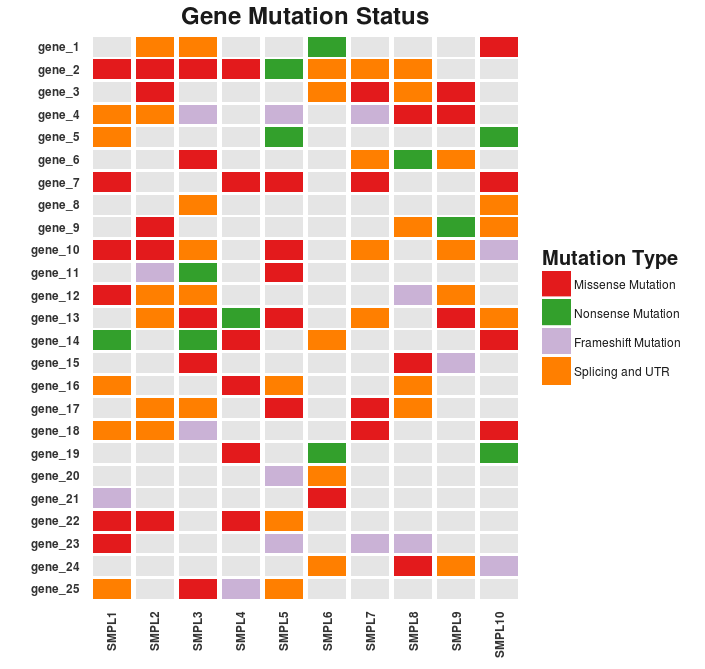
The resulting chart looks pretty neat. There are still a couple of details to fix. These may include the formatting of the legend and the axes text as well as the margins of the cart area.
p <- p + theme(text = element_text(color = “gray20”),
legend.position = c(“right”), # position the legend in the upper left
legend.justification = 0, # anchor point for legend.position.
legend.text = element_text(size = 9, color = “gray10”),
title = element_text(size = 15, face = “bold”, color = “gray10”),
axis.text = element_text(face = “bold”),
panel.grid.major.y = element_blank(),
panel.grid.major.x = element_blank()
)
p <- p + theme(axis.text.x=element_text(angle = 90, hjust = 1 , vjust = 0.5,
margin=margin(-8,0,-15,0)),
axis.text.y=element_text(hjust = 1, vjust = 0.5,
margin = margin(0,-10,0,0)))
p
Success! Here’s the final result.
 The full code used for generating the seatmap chart used in this example can be found on GitHub at the following address: https://github.com/dami82/ggplot2/blob/master/seatmap_chart.R.
Thank you!!!