Many MATLAB functions are readily translatable to R, but of course this is not always true. While translating a MATLAB script into R, I run into the following problem. I couldn’t find an R function that could replace MATLAB’s silhouette() function. The cluster R package includes a silhouette() function, but it only performs a fraction of what MATLAB’s silhouette() does. Luckily, creating a custom complete silhouette() function is easy in R.
How does silhouette() work in MATLAB
The silhouette() function produces a plot that provides a visual representation of the quality of a clustering. Indeed, the silhouette value for each data point of a matrix is a measure of how similar that point is to all other points in the same cluster, when compared to points in other clusters. The silhouette value ranges from -1 to +1. A high silhouette value indicates that i data point is well-matched to its own cluster, and poorly-matched to neighboring clusters. As defined here, the silhouette value for the ith data point (Si) is defined as:
Si = ( bi – ai ) / max( ai, bi)
where ai is the average distance from the ith point to the other points in the same cluster as i, and bi is the minimum average distance from the ith point to points in a different cluster, minimized over clusters.
Split the job into discrete tasks in R
To run this analysis and generate a silhouette plot, we need to:
- calculate the distance of each data point to all other data points in the dataset. This requires defining a distance function that will be used for assessing the similarity/dissimilarity among data points. A distance matrix of this kind may be easily calculated in R via the dist() function from the proxy package
- Calculating the silhouette value (Si) for each data point. This is obtanied via the silhouette function in the cluster package
- Plotting the values for generating the silhouette plot. this may be done using ggplot2 or the barplot() function from the graphics package
The code may be as simple as what shown below.
dist.matrix <- as.matrix(proxy::dist(x = my.data, method = my.method))
sil.check <- cluster::silhouette(x = as.vector(my.clusters), dist = dist.matrix)
# {… sort sil.check by cluster and by silhouette values within the same cluster …}
barplot(sil.check, col = as.factor(my.clusters)
Here is an example using a random matrix of numeric values
library(proxy)
library(cluster)
library(pracma)
#
set.seed(999)
#
my.data <- matrix(runif(600, min = 0.15, max = 0.99), ncol = 20)
my.clusters <- base::sample(c(1,2), size = 30, replace = T, prob = c(0.6,0.4))
#
## setp 1: generate a distance matrix
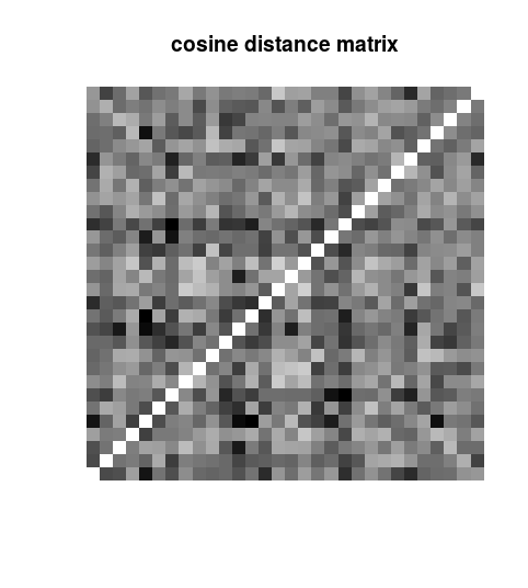
dist.matrix <- as.matrix(proxy::dist(x = my.data, method = “cosine”))
image(dist.matrix, axes = FALSE, main = “cosine distance matrix”, col = colorRampPalette(colors = c(“white”, “black”))(100))
Note that we could have used a different distance function instead of the “cosine”. For example, we could have used an “euclidean” distance. The distance matrix is a n by n matrix, where n is the number of data points (rows of the data matrix). The distance matrix looks like:
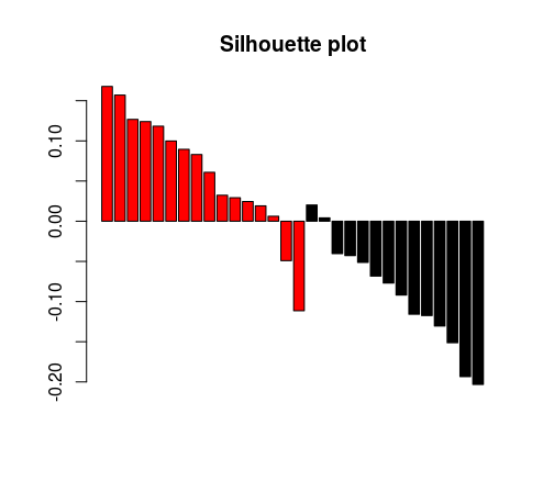
# Calculate silhouette values and then plot
sil.check <- cluster::silhouette(x = as.vector(my.clusters), dist = dist.matrix)
tmp <- lapply(unique(sil.check[,1]), (function(clid){
part.out <- sil.check[sil.check[,1] == clid,]
part.out[order(part.out[,3], decreasing = TRUE),]
}))
tmp <- do.call(rbind, tmp)
barplot(tmp[,3], col = as.factor(tmp[,1]), main = “Silhouette plot”)
And this is the resulting plot. As expected, in a random matrix, the clustering looks pretty poor.
 We can wrap this code into a custom function, that will accept the following arguments: dataset, grouping (clustering) factor and distance function to be used. Here is the code. This function will be released as part of the <<workinprogress>> package.
silhouette.matlab <-function(data, fac, method = ‘cosine’, plot = TRUE){
#
# Damiano Fantini f(x)
#
if (nrow(data) != length(fac))
stop (“Bad input!”)
require(“proxy”)
require(“cluster”)
dist.matrix <- as.matrix(proxy::dist(x = data, method = method))
sil.check <- cluster::silhouette(x = as.numeric(as.factor(fac)), dist = dist.matrix)
if (plot == TRUE) {
tmp <- lapply(unique(sil.check[,1]), (function(clid){
part.out <- sil.check[sil.check[,1] == clid,]
part.out[order(part.out[,3], decreasing = TRUE),]
}))
tmp <- do.call(rbind, tmp)
barplot(tmp[nrow(tmp):1,3],
col = as.factor(tmp[nrow(tmp):1,1]),
horiz = TRUE,
xlab = “Silhouette Value”,
ylab = “Samples by Cluster”,
main = “Silhouette Plot”,
border = as.factor(tmp[nrow(tmp):1,1]))
}
return(as.vector(sil.check[,3]))
}
And now, let’s try to use some real-world data. Let’s check the quality of the clustering in Figure 3 of the following scientific paper: http://www.nature.com/nature/journal/v507/n7492/full/nature12965.html
library(TCGAretriever)
#
# Retrieve Molecular clusters for TCGA BLCA from BROAD
my.url <- “http://gdac.broadinstitute.org/runs/analyses__2016_01_28/data/BLCA-TP/20160128/gdac.broadinstitute.org_BLCA-TP.Aggregate_Molecular_Subtype_Clusters.Level_4.2016012800.0.0.tar.gz”
download.file(my.url, destfile=”my.tmp.tar.gz”)
my.file <- grep(“MANIFEST”, untar(“my.tmp.tar.gz”,list=TRUE), value = TRUE, invert = TRUE)
untar(“my.tmp.tar.gz”,files = my.file)
mol.clusters <- read.delim(my.file)
mol.clusters.hierarc <- mol.clusters[,7]
names(mol.clusters.hierarc) <- mol.clusters[,1]
mol.clusters.hierarc <- mol.clusters.hierarc[!is.na(mol.clusters.hierarc)]
mol.clusters.hierarc <- mol.clusters.hierarc[mol.clusters.hierarc %in% c(1,2,3,4)]
#
# Retrieve Expression Data from TCGA BLCA
my.genes <- keys(Homo.sapiens, keytype = “SYMBOL”)
my.seq.data <- fetch_all_tcgadata(“blca_tcga_rna_seq_v2_mrna”,
“blca_tcga_rna_seq_v2_mrna”,
my.genes, mutations = FALSE)
my.seq.data <- my.seq.data[!duplicated(my.seq.data[,2]),]
rownames(my.seq.data) <- my.seq.data[,2]
my.seq.data <- data.frame(t(my.seq.data[,-c(1,2)]), stringsAsFactors = FALSE)
tmp.csid <- rownames(my.seq.data)
my.seq.data <- apply(my.seq.data, 2, as.numeric)
rownames(my.seq.data) <- tmp.csid
#
# Remove NAs and low-expression genes, then pick the 1000 most variable genes
my.seq.data <- my.seq.data[,apply(my.seq.data, 2, (function(cl){ sum(is.na(cl)) / length(cl) < 0.1 }))]
my.seq.data <- my.seq.data[,apply(my.seq.data, 2, (function(cl){ median(cl) > 50 }))]
#
for (i in 1:ncol(my.seq.data)) {
tmp <- my.seq.data[,i]
tmp <- log10(tmp + 0.5)
tmp <- (tmp – mean(tmp))/mean(tmp)
my.seq.data[,i] <- tmp
}
gn_to_keep <- names(sort(apply(my.seq.data, 2, stats::var), decreasing = TRUE) [1:1000])
my.seq.data <- my.seq.data[,gn_to_keep]
#
# Check data consistency and assign clusters
my.seq.data<- my.seq.data[rownames(my.seq.data) %in% names(mol.clusters.hierarc),]
final.clust <- as.character(sapply(rownames(my.seq.data), (function(id){
mol.clusters.hierarc <- mol.clusters.hierarc[names(mol.clusters.hierarc) == id]
})))
#
# Call silhouette.matlab()
silhouette.matlab(my.seq.data, final.clust)
#
# Success!!
#
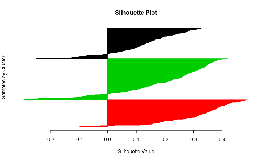 I would have expected better scores, but the result is not that bad!!! Anyway, we just generated a beautiful silhouette plot!
Success!